
Premier League Away Kits 2025-26: Ranked from Best to Worst
The 2025-26 Premier League season has delivered a stunning collection of away kits that blend nostalgia, innovation, and cultural storytelling. From cult-classic throwbacks to daring new designs, this season's away shirts have given fans and collectors plenty to talk about. We have ranked all 20 Premier League away kits from worst to best, breaking down the design inspiration, colour choices, and overall impact of each shirt.
Whether you are looking to add a new away shirt to your collection or just want to see how your club fares, explore our full range of Premier League kits to find your favourite.
The Complete Ranking: 20th to 1st
20. West Ham United (Umbro)
It has been a rough year for West Ham in the kit department. Multiple reviewers placed West Ham dead last in their away kit rankings, citing a severe lack of creativity. Umbro delivered a safe, uninspired design that fails to stand out in a season full of bold choices. The colour palette is flat, and there is nothing in the detailing that gives this shirt any personality or edge. A forgettable effort.
19. Crystal Palace (away)
The Athletic's comprehensive ranking placed Crystal Palace's away kit dead last overall, describing the gold-toned design as resembling "something far less valuable" than the "Palace gold" the club intended. The Galaga-style spaceship motifs on the shirt were criticised for being too busy and at odds with the club's identity. A rare miss from Palace, who have delivered some excellent kits in recent seasons.
18. Aston Villa (Adidas)
Adidas marketed this kit as a tribute to Birmingham's Bullring shopping centre, with hexagonal patterns meant to reference the futuristic facade of the Selfridges building. ESPN ranked it 11th out of all kits released, noting its curious inspiration. The black-and-steel grey palette was described by The Athletic as "something you would wear for a trip to the dump." It is harmless but lacks ambition.
17. Newcastle United (Adidas)
Green has become Newcastle's unofficial third colour, and this marks the fourth consecutive season it has appeared in their away strip. Yahoo Sports placed it among the five worst away kits, noting the Saudi ownership's continued influence on colour choices. While inoffensive at first glance, the stripe overload and comparisons to a far superior third kit in navy, green and gold from the 1997-98 era work against it.
16. Tottenham Hotspur (Nike)
Released with the dramatic tagline "In darkness, we dare," Spurs' all-black away kit features a subtle dark-grey grid pattern that is barely visible. ESPN ranked it 58th overall, calling it "dreary stuff." The Athletic quipped that the most interesting aspect of the kit is its resemblance to "a math exercise book." It is marginally more interesting than the home shirt, but that is not saying much.
15. Manchester City (Puma)
Another all-black away design, and while it is more polished than Tottenham's effort, The Athletic criticised it as "more intelligent than Spurs but still relying too heavily on all-black." A shiny badge provides some interest, but it feels like a lazy choice from Puma. The away kit stands in contrast to City's excellent third kit inspired by the club's formative years as St Mark's (West Gorton) FC, which was widely praised.
14. Everton (Castore)
Pastel yellow is a bold choice for an away kit, but it did not convince many reviewers. The Athletic described it as "a colour better suited for disappointing macarons than for an away shirt." Everton's home kit, inspired by the new Hill Dickinson stadium with its Mersey river-wave pattern, was universally praised, but this away effort feels like an afterthought.
13. Brentford (Joma)
Yahoo Sports placed Brentford's brown-and-gold away kit at number three on their worst kits list, calling it a "brown disaster." However, not everyone agreed. Footy Headlines' Phil Delves named it among his five best kits of the season, praising the unique colour combination. A genuinely divisive design that you will either love or hate.
12. Burnley (away)
Mixed reviews surround Burnley's away effort. Some fans praised the ambitious design, while others felt it tried too hard. Kit reviewers on YouTube placed it eighth, noting that "it goes somewhere in the middle." The design has more personality than many on this list, but it does not quite come together as a cohesive whole.
11. Manchester United (Adidas)
Adidas went with a tribute to the iconic 1990-92 "snowflake" away kit, featuring a washed-out interpretation with the snowflake design appearing as a subtle background pattern in metallic lilac. Goal Cart praised it as "clean and well-executed", while The Athletic was less enthusiastic, suggesting it could be "worn when Ruben Amorim has been let go." A safe retro nod that does not take enough risks.
The Top 10
| Rank | Club | Brand | Key Design Feature | Inspiration |
|---|---|---|---|---|
| 10 | Nottingham Forest | Macron | All-white with beige lace-industry motifs | Nottingham lace heritage |
| 9 | Fulham | Adidas | Bold geometric shapes | Modern abstract design |
| 8 | Brighton & Hove Albion | Nike | Clean pastel tones | South coast seaside palette |
| 7 | Manchester City | Puma | Metallic trim, St Mark's crest | Club's founding as St Mark's FC |
| 6 | Liverpool | Adidas | Green-and-red collar, shield crest | 1990s Spice Boys era retro |
| 5 | Arsenal | Adidas | Metallic lightning bolt on navy | 1995-96 Royal Arsenal Gatehouse |
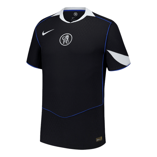
| 4 | Chelsea | Nike | Red and green pinstripes on white | 1974-75 Hungarian-inspired kit |
| 3 | Bournemouth | Umbro | Blue-and-black stripes with aqua | 2011-12 League One era |
| 2 | Leeds United | Adidas | Yellow with navy trim, colour-matched logo | Classic Leeds yellow away |
| 1 | Sunderland | Nike | Lighthouse woven into fabric | Roker beach lighthouse |
10. Nottingham Forest
An all-white design featuring subtle beige patterns inspired by Nottingham's historic lace industry. The Athletic ranked it lower, noting that "all-white kits are typically a no-go unless you are Real Madrid," but the cultural detail earns it a spot in the top 10 for effort and local pride.
9. Fulham
At first glance, Fulham's away kit looks unusual, but the geometric shapes throughout the body of the shirt show more creativity than many Big Six efforts. Kit reviewers placed it sixth in their rankings, praising Fulham for going "further than Man City in terms of creativity."
8. Brighton & Hove Albion
Brighton's clean, pastel-toned away kit captures the south coast aesthetic beautifully. The understated design appeals to fans who prefer minimalist kits that do not try too hard, and the colour choices evoke the seaside setting of the Amex Stadium.
7. Manchester City -- Third Kit (Puma)
While City's actual away kit languishes in black mediocrity, their third kit is another story entirely. Goal Cart named it the best among the Big Six, praising the design inspired by the very first kit worn during the club's formative years as St Mark's (West Gorton) FC. The metallic trim adds a premium feel, and the low-opacity badge creates a clean, modern look.
6. Liverpool (Adidas)
Adidas' debut away kit for Liverpool features a redesigned Liver bird shield crest and green-and-red collar details. The Athletic gave it a big thumbs up, highlighting the contrasting red shorts and declaring the socks "the best of the season." The retro shield emblem connects to Liverpool's storied history, though Goal Cart was more critical, ranking it sixth among the Big Six.
5. Arsenal (Adidas)
Arsenal have returned once again to their legendary 1995-96 "lightning strike" away kit. According to ESPN, the dark navy base features a two-tone "bolt" with a metallic shimmer that improves on the matte turquoise of the original 1990s design. Red Three Stripes on the sleeves and silver accents on the logos add contrast. This is the third time Adidas has reinterpreted this classic, and Footy Headlines named it among the five best kits of the season. A genuine collector's item.
4. Chelsea (Nike)
Chelsea's sponsorless away shirt is a masterpiece of restraint. According to SB Nation, the warm off-white base features subtle red and green pinstripes inspired by the 1974-75 away kit, itself a tribute to Hungary's "Magnificent Magyars." Chelsea FC described it as "a London masterpiece," and it debuted at the FIFA Club World Cup. The absence of a sponsor creates a clean, premium aesthetic that Goal Cart ranked second among the Big Six.
3. Bournemouth (Umbro)
The Cherries' blue-and-black striped away kit has been a revelation. According to the BBC, the return of blue and black "pays homage to the club's vibrant heritage," referencing the 2011-12 League One era. Footy Headlines noted the aqua pinstripe detailing and embroidered aqua crest that elevate the design. The Athletic called it "absolutely stunning," suggesting Inter Milan legend Massimo Moratti would regret not using a similar sky-blue accent for his own club.
2. Leeds United (Adidas)
Leeds' yellow away kit earned widespread acclaim and was ranked second overall by The Athletic. The standout detail is Adidas' white central stripe running through the kit, and Red Bull even agreed to adjust their logo colours to match the design -- a flexibility that impressed reviewers. The navy trim and collar create a classic look that feels both timeless and contemporary. A shirt that Leeds fans will be queuing to buy.
1. Sunderland (Nike)
The unanimous pick for the best Premier League away kit of 2025-26. The Athletic declared that the Roker beach lighthouse is "woven into the fabric," creating a locally-sourced design that feels genuinely special. The subtle chevron detail was praised as something that "already resembles a beloved retro remake." Nike has produced a shirt that transcends football fashion -- it is a love letter to Sunderland and its coastline. Delightful, and thoroughly deserving of the top spot.
Key Design Trends This Season
The Retro Revival
This season's away kits are dominated by nostalgic throwbacks. Arsenal returned to 1995-96, Chelsea to 1974-75, Manchester United to 1990-92, and Leeds channelled their classic yellow. The message from brands is clear: fans want kits that connect them to their club's history, reimagined with modern materials and technology.
The Death of All-Black
Both Tottenham and Manchester City opted for all-black away designs and were punished by reviewers. The consensus is that blackout kits feel lazy and uninspired in a season where others are pushing creative boundaries. Clubs looking to play it safe with black should take note: it is no longer a shortcut to looking stylish.
Cultural Storytelling
The most praised kits this season tell stories rooted in local culture. Sunderland's lighthouse, Chelsea's Hungarian connection, Bournemouth's League One heritage, and Nottingham Forest's lace industry all demonstrate that the best kits are those with genuine meaning behind the design. Football shirts are becoming cultural artefacts.
Sustainability Matters
Most major brands now use recycled polyester and sustainable manufacturing processes as standard. This is no longer a differentiator but a baseline expectation, with Nike's Move to Zero and Adidas' Primegreen initiatives leading the way across the league.
Find Your Favourite Kit
Whether you fancy the lightning bolt of Arsenal, the pintstripes of Chelsea, or the blue-and-black stripes of Bournemouth, you can find the latest Premier League kits in our collection. Looking ahead to international football? Check out our World Cup 2026 collection for the latest national team shirts.
Browse our full catalogue for the widest selection of football kits in the UK, or get in touch if you have any questions about sizing or availability.